Back

Hidden Havens

Health, Beauty & Wellness

Brand Architecture

Hidden Havens is a boutique massage studio designed as a retreat from the noise of everyday life – a place where care is intentional, touch is respectful, and wellbeing is nurtured at its own pace. Rooted in the belief that looking after your body should feel safe, supported, and deeply personal, the studio offers a calm and private environment where clients can reconnect with themselves.

Industry

Lifestyle & Wellness

Client

Josh Hyams

Year

2024

Strategy

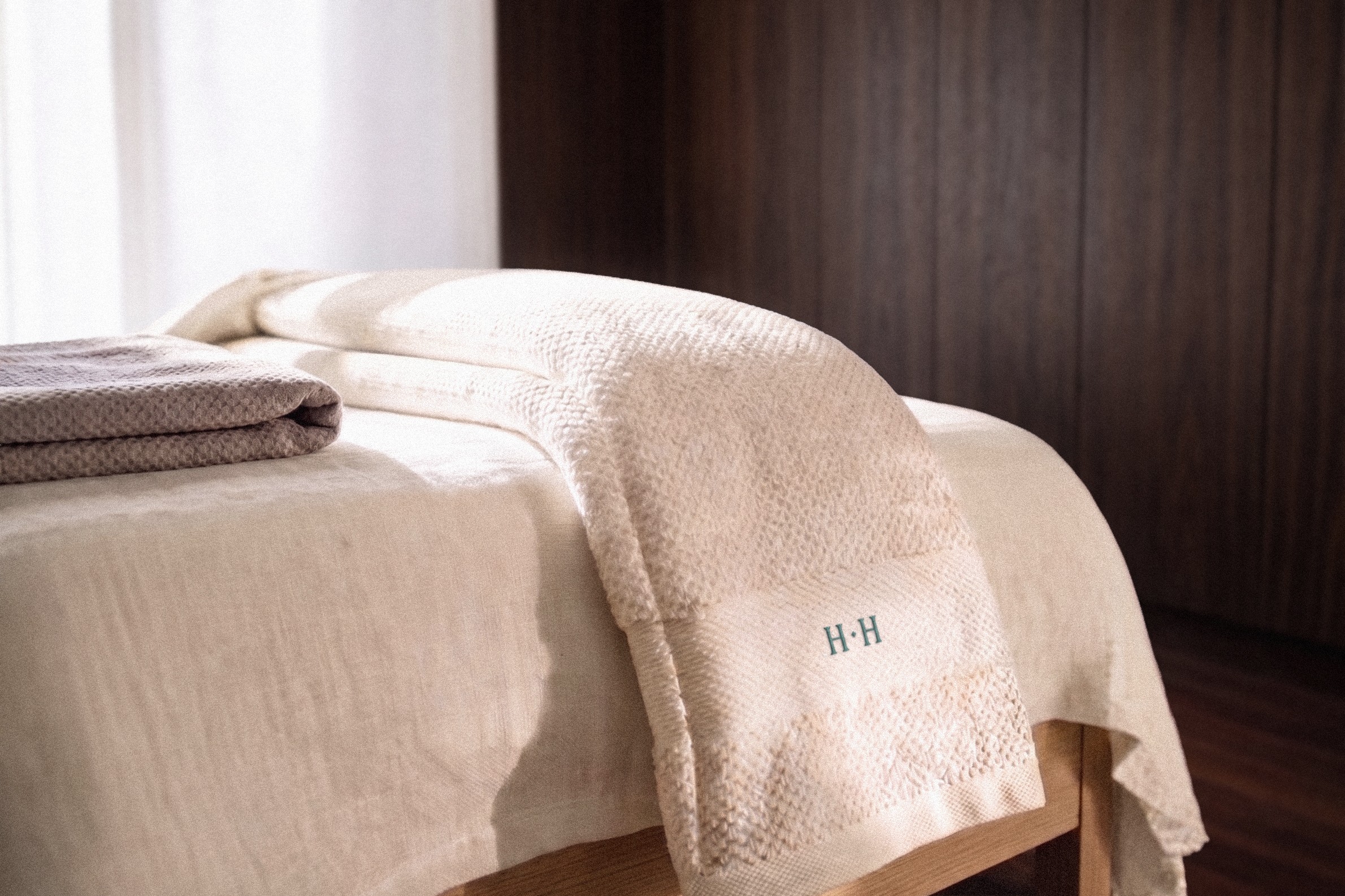
The identity for Hidden Havens moves away from the overly sanitised, corporate feel common in the wellness space, focusing instead on something more grounded and atmospheric. Inspired by the idea of a private sanctuary, the logo takes on a Tolkien-esque illustrated style, suggesting a hidden, tranquil place set apart from the everyday. A calligraphic serif typeface adds a sense of elegance while remaining flexible across different uses. Paired with a palette of soft chalk tones and deep forest green, the overall look feels calm, natural, and quietly distinctive – creating a brand that is more personal, inviting, and rooted in a sense of place.

The identity for Hidden Havens moves away from the overly sanitised, corporate feel common in the wellness space, focusing instead on something more grounded and atmospheric. Inspired by the idea of a private sanctuary, the logo takes on a Tolkien-esque illustrated style, suggesting a hidden, tranquil place set apart from the everyday. A calligraphic serif typeface adds a sense of elegance while remaining flexible across different uses. Paired with a palette of soft chalk tones and deep forest green, the overall look feels calm, natural, and quietly distinctive – creating a brand that is more personal, inviting, and rooted in a sense of place.

Deliverables

Corporate identity

Corporate identity